

Role
UX Research
UI and prototyping
Type
Metor and peer reviews
Timeline
Mar 2020 - Aug 2020
OVERVIEW
The goal of the project is to identify the main touch points of a typical user navigation on an airline booking and design the related solutions in a brand new airline app called "Ifly".
This case study was my graduation project for the UX design institute. Throughout this project I performed both the research and design process in order to achieve the professional diploma.
WHAT IS THIS DESIGN ABOUT
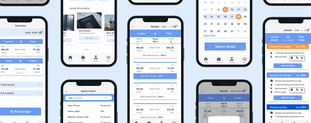
An mobile App for an Airline: The Project is focus on the Booking Process.
The end user: An everyday adult familiar with mobile apps, looking for a straightforward and reliable way to plan and manage their flights.
PROBLEM
Users struggle to find features that help them progress through the process.

SOLUTION
I streamlined the fare and flight selection process by introducing a clear button design and strong visual feedback.
THE PROCESS
“I followed the course steps but went the extra mile in some areas, like iterations drawing on my graphic design experience.”
RESEARCH
Competitive Benchmarking
Strong industry conventions, patterns and stage process
It's difficult for users to find relevant information quickly.

Online Survey
68% achieved their goal of booking a flight in one session
It's difficult for users to find relevant information quickly.

Users Testing
Only 50% of users completed the task during six tests.
Tell me about the last time you book a flight?
What motivated you to decide to book that flight?
Describe what was the most difficult about the process?

INSIGHT - PROBLEM STATEMENT
Casual travellers need an intuitive flight and fare selection flow to avoid confusion and prevent abandoning the process.
Competitive Benchmarking
Across the airline industry, there is a well-defined process for booking flights.
Online Survey
Users associate their travel experience with the in-app experience.
Usability Test
The selection of both the flight and the type of fare is a major pain point for the user.
DEFINE
AFFINITY DIAGRAM / THEMES
A decluttered UI enhances users’ ability to understand the actions needed at each step of the process.

Theme 1: App performance
Home, location fields, calendar, summary or selecting seat don’t have major usability problems.
Theme 2: User Motivation
Find the flight that suits the price, location, and flight timings.
Theme 3: User Retention
User can give up when find late on the process that there’s a layover.
BOOKING FLIGHT PROCESS JOURNEY MAP
User: Experienced using App
Scenario: During the evening at home, want to find a flight for a city break inside Europe

INFORMED SOLUTION
Focus on improving major and minor navigation.
Fix unexpected exchange between flights
The user has to know what is happening at all times and know what state of the flow they are in.
Create an intuitive Fares selection that does not interrupt the flow
The user must have decision control at all times of the flow and know what steps to follow.
Improve UI stage of calendar and compare Fare
Despite being minor improvements, they are important since each screen counts in order to create a fluid flow.
“I believe that adding a clear transition to the return flight, redesigning the fare selection options, and displaying them on a dedicated screen would make it easier for users to choose a suitable flight, ultimately increasing bookings.”
IDEATE / VALIDATE / PROTOTYPE
USUER FLOWCHART
Defined the main and sub-screens to determine where specific content should be placed.
Organised the collected data for clarity and structure.
Began designing a detailed architecture for the booking process.

TESTING CONCEPTS
How to improve keeping the conventions?

DESIGN EXPLORATION
Focus on the 1 and 2 ideas
Showing different design expressions I was going through, doing different explorations, and exploring different ways of how I bring the product solution to life.

TEST AND VALIDATION
VALIDATE
The unexpected swap between flights is improved.
All the information about the flight is upfront and clear.
NEEDS IMPROVE
Fare selection lead the user to select fares first but still have to many steps and clicks.
VALIDATION AND IMPROVING
Focus on the 1 and 2 ideas
If I use the compare fares screen at the same time select the fare I will reduce steps and at the same time improve the UI layout of that and lead the user to the stages flow, uninterrupted and so I can mix a minor improvement to a major and fix two issues.

MAJOR IMPROVEMENTS
Unexpected swap between destination and return
Originally designed effective but used too many steps.
Now, the number of screens has been reduced improving:
User focus on the task
Redesign UI to improve the readability
Clear visual animation when change to return

Intuitive fare selection
Originally designed for three screen and fares are divided into three stages.
Upon feedback, the flow leads you through the steps but results in many stages.
Mixing the compare fare content with the three difference fare card and putting together in to one screen allows to:
Reduce the time
Easy to read and compare between fares
Increase the user retention

Select Fare
The purpose is to draw the user's attention to the fare they are going to select.
This prevents the user from accidentally transitioning to the return flight

DESIGN SYSTEM
Foundations and components
To create the UI design system in order to maintain consistency through all the experience and improve the usability.

HANDOFF
Allowing me to identify areas for further improvement.

NOTE
“The course did not require the handoff to include a fully designed interface with colours, as the focus was on solving the problem through UX methodologies. However, I chose to go the extra mile by continuing to refine and iterate on the design.”
TAKEAWAY
Learning
From no idea to a solution
Know well the product and the user needs and mental models
Aks the users is key define well the problem to solve explore the solutions and test
What I’d do differently
Applyied more methodologies
Brainstorming, How my we?, Scamper to help me to find more solutions possibles

B2B | HEALTHCARE | PART 1
6 min read
How do we redesign a medical legacy system to fit a new screen format?

B2B | HEALTHCARE | PART 2
5 min read
How can we add features while keeping the user flow simple?
B2B | REAL ESTATE |
5 min read