
Role
Led design strategy and execution. User interface and prototyping.
Type
Responsive website
Timeline
Mar 2024 - Jul 2024
Status
Development
OVERVIEW
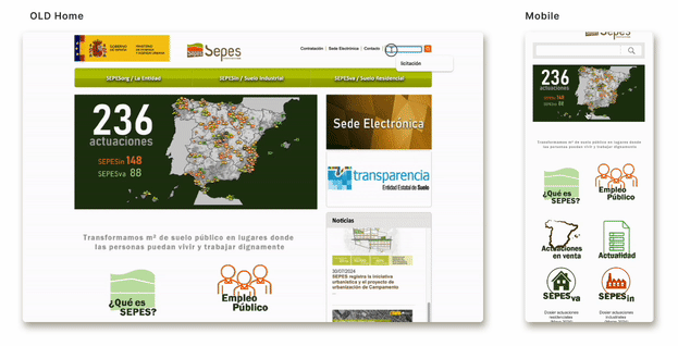
The outdated SEPES website raised concerns about its performance and compatibility with modern devices.
Quattro IDCP chose me to lead this project, recognising my expertise in revamping legacy systems and modernising digital platforms.
WHAT IS THIS DESIGN ABOUT
Responsive website: Platform for a governmental public entity that manages land development in Spain.
The end user: Mainly Citizens and Business and Real state developers.
PROBLEMS TO SOLVE
Develop a new design using the existing content, including text, images, and components such as buttons and links.
Improve the user experience in mobile devices.
SEPES’s new branding is difficult to apply to the current website and does not meet accessibility standards.

SOLUTION
Designed a responsive, easy to navigate with a minimal use of the color.

DESIGN IMPACT
Designed an accessible and cohesive branding system for digital products.
Created a reusable Figma design system to support future scalability.
Introduced an improved handoff process, streamlining collaboration across the team.
BUSINESS GOALS
Boost conversion rates while streamlining land searches and acquisitions and comply with AAA WCAG 2.2 standards.
KICKOFF
“Before I joined, the Project Manager had already defined the new information architecture, while the development team identified the search engine as the most critical feature. ”
RESEARCH
HOW WELL DOES THE CURRENT WEBSITE SERVE ITS USERS?
UX UI Audit
Repetitive content and cluttered layout.
It's difficult for users to find relevant information quickly.

WHAT SHOULD WE PRIORITISE ON THE WEBSITE?
Competitive analysis
Unclear information on product detail pages.
Product detail pages had unclear structures, making it hard for users to understand important details about available land, hindering informed decisions.

3.WHAT IS THE TYPICAL USER JOURNEY WHEN SEARCHING AND
APPLYING FILTERS?
Flow chart - Information Arquitecture
Ineffective search and filters
Inefficient search functionality and limited filters made the process time-consuming, especially on mobile devices, complicating the search experience.

DISCOVERY INSIGHT
To make the content easier to scan and find, I will need to improve the design foundation and propose a new colour palette for the design system.
Mobile first mind set
Improve image quality
New Type family need it
DESIGN PRINCIPLES
Before jumping into solution mode I set a foundations principles that connect the Business goals whit the discovery insights.
Visual consistency
A style guide to ensure cohesive design across all platforms.
Enhanced visual appeal
Use high-quality, graphics and pictures.
Optimised scannability
Enabling users to locate relevant information.
GETTING THE FIRST FEEDBACK
My Product Manager and I set a goal to get approval for the new colour palette and design system proposal during the first meeting.
The proposal was approved.

First design proposal (Home screen)

New design system proposal
PERSONAL NOTE
“This project included many screens and a lot of content. The further we progressed, the harder it would be to make fundamental changes to colours and typography, as they would structurally impact the screens. ”
DEVELOPMENT - REFINING THE LOOK AND FEEL + PATTERNS
DESIGN SYSTEM
Components were designed with a mobile-first mindset, ensuring proper contrast and accessibility standards.

ITERATIONS
Although the design followed a mobile-first approach, I had to prioritize the web-based home screen design because the client found it difficult to make decisions based solely on the mobile version.
Home screen: Establishing the foundation for the website’s design was crucial, making the home screen a top priority to ensure progress.

MAJOR IMPROVEMENTS
Navbar and Navigation
PROBLEM
The navigation bar is not fixed when scrolling down
Interactive components don't react when hover.
Navigation dropdonw menus spread across navbar
SOLUTION
Introduced a sticky menu for constant access.
Improved responsiveness of interactive components.
Made the menu accessible on both desktop and mobile.

Filters and information
PROBLEM
Checkboxes on mobile did not maintain responsiveness.
Interactive components lacked hover feedback.
Design felt confusing and included redundant elements.
SOLUTION
Ensured filters are fully responsive across all devices.
Enhanced interactivity with improved hover states.
Simplified design structure for better navigation and usability.


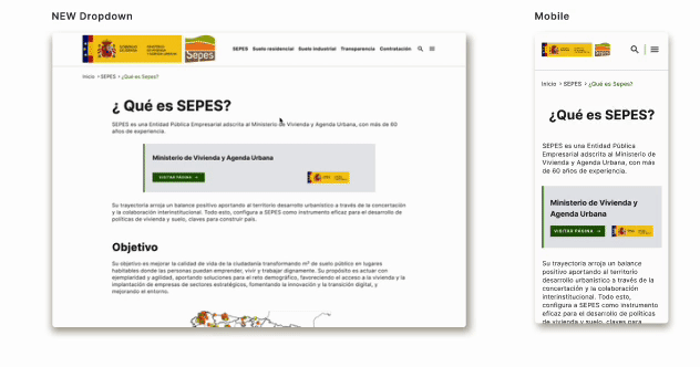
Dropdown menus and Information Aquitecture
PROBLEM
Side navigation menus were hard to use and lacked clarity.
Links and components were unresponsive to hover actions.
Screens felt cluttered with overly dense content.
SOLUTION
Introduced a refined information architecture for smoother navigation.
Improved hover responsiveness for all interactive elements.
Organized content into dropdown menus for improved clarity and readability.

SMOOTH HANDOFF PROCESS
Collaborating with developers and asking what they needed made the handoff seamless. This approach allowed me to deliver work with minimal follow-ups while improving efficiency and communication.


TAKEAWAY
Adapt to the Client
Not all clients have the same understanding of design or wireframes. Adapting the delivery, process, and language for each iteration was key to ensuring inclusivity and clarity.
Collaborate with Developers
Working closely with developers and discussing ways to improve the handoff process was crucial for a smooth transition, and it provided valuable learning opportunities.

B2B | HEALTHCARE | PART 1
6 min read
How do we redesign a medical legacy system to fit a new screen format?
B2B | HEALTHCARE | PART 2
5 min read
How can we add features while keeping the user flow simple?

ONLINE COURSE | BOOKING | 4 min read
